
Accessibility Heuristics: A Practical Guide to Evaluating Inclusive Design
Accessibility heuristics are broad principles for evaluating inclusive design. Learn the three categories of heuristics, how to run an evaluation, and where automated scans fall short.
Yuvan Sundrani · 11 min read
autosana.ai
An accessibility heuristic is a broad principle used to evaluate whether an interface works for people with disabilities. Instead of auditing against every rule in WCAG, a heuristic evaluation applies general principles to find the most impactful barriers quickly and cheaply.
The approach originates from Jakob Nielsen's 10 usability heuristics, which have guided UX evaluation since the 1990s. Accessibility researchers adapted that framework to cover barriers experienced by people with visual, motor, cognitive, and auditory impairments.
The result is a method that sits between automated scanners and formal WCAG audits. Scanners are fast but shallow. WCAG audits are thorough but slow. An accessibility heuristic evaluation is the middle layer that catches design-level problems neither of the other two can reach.
This guide covers what accessibility heuristics are, how they compare to other methods, the principles themselves organized by user need, and how to run an evaluation that produces actionable results.
How accessibility heuristics compare to WCAG audits and automated scans
These three methods are not interchangeable. Each catches a different class of problem at a different point in the lifecycle.
Automated scans run tools like axe or Lighthouse against your code. They catch programmatic issues: missing alternative text, incorrect ARIA roles, insufficient color contrast. They scale effortlessly and run on every deploy. But by WCAG success criteria count, they cover roughly 30% of what needs to be tested. They cannot evaluate navigation logic, cognitive load, or interaction patterns.
WCAG audits are formal compliance checks against the 87 success criteria in WCAG 2.2. They are thorough, produce detailed conformance reports, and are required for legal compliance in many jurisdictions. They also take days and usually happen right before launch, when fixes are most expensive.
Accessibility heuristic evaluations are expert reviews against broad principles. They take 1 to 2 hours per evaluator, catch structural and design-level barriers, and work best on wireframes and prototypes before a single line of code ships. They do not produce a compliance report, but they catch the problems that make a WCAG audit painful later.
The practical approach: run accessibility heuristic evaluations during design, automated scans in CI, and WCAG audits before launch. Each layer covers what the others miss.
The accessibility heuristic principles
Competitors in this space list accessibility heuristics as flat numbered lists of 5 or 10 items. That is fine for reference, but it obscures the underlying structure. Accessibility barriers fall into three categories based on what they block the user from doing. Organizing the principles this way makes evaluation faster and findings more actionable.
Perception heuristics: can the user receive the information?
These accessibility heuristics address whether content reaches the user regardless of their sensory abilities. Every piece of meaningful information should be available through at least two channels.
Provide alternatives for every sensory channel. Visual content needs text equivalents. Audio needs captions or transcripts. Video needs both. An icon-only button with no text label is a perception barrier because it relies entirely on vision to convey its function. Adding a label like "Save" or "Download" makes the same content available to screen reader users and sighted users who do not recognize the icon.
Do not rely on color alone to convey meaning. A form that marks errors only with a red border fails two groups at once. Colorblind users do not see the red. Screen reader users do not hear it. The error exists, but it is locked behind a single sensory channel. Adding a text message like "Please enter a valid email address" and an error icon solves both.
Make content distinguishable. Text should have sufficient contrast against its background. Interactive elements should be visually distinct from static content. Adjacent links in a list should be distinguishable from each other. When content blends together, users with low vision lose the ability to parse the page.
On mobile, perception barriers compound. A notification badge designed for a 6.7-inch flagship screen can be unreadable on a 5-inch budget device. Mobile UI testing on real hardware is where these discrepancies surface, because what renders cleanly in a design tool does not always translate to every screen.
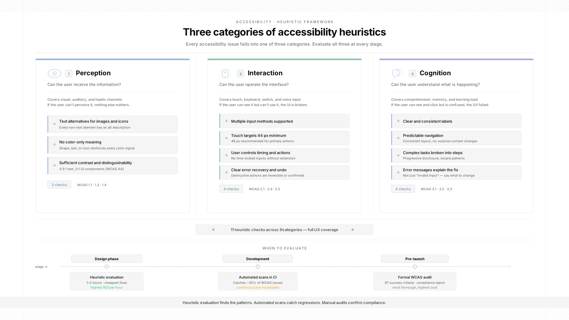
Interaction heuristics: can the user operate the interface?
These accessibility heuristics address whether users can complete tasks regardless of their input method. Every interactive element should work with a mouse, keyboard, screen reader, switch device, and touch.
Support multiple input methods. A drag-and-drop interface that only responds to pointer input blocks anyone who navigates by keyboard, voice, or switch. Every draggable action needs a keyboard alternative: arrow keys to reorder, buttons to move items, or a menu with "Move up" and "Move down" options.
Make touch targets large enough. WCAG 2.2 sets a minimum of 24x24 CSS pixels at Level AA. The enhanced recommendation is 44x44. A primary action button that is too small to tap reliably turns every interaction into a frustration for users with motor impairments. They hit adjacent elements, trigger unintended actions, and eventually give up.
Give the user control over timing and actions. Interfaces that auto-advance, auto-submit, or impose time limits without a way to extend them remove control from the user. A form that submits as soon as the user stops typing bypasses review entirely. A countdown timer with no pause option creates pressure that disproportionately affects users with cognitive and motor disabilities.
Provide clear error recovery. A "Delete Account" button with no confirmation dialog is a catastrophic interaction failure. A user with a motor impairment who accidentally taps the wrong target loses their account with no recovery path. Destructive actions need confirmation. Errors need undo.
Cognition heuristics: can the user understand what is happening?
These accessibility heuristics address memory, attention, comprehension, and orientation. They are the hardest category to automate because they depend on human judgment about clarity and complexity.
Use clear, consistent labels. Every button, link, and form field should communicate its purpose in plain language. An icon-only toolbar with no text labels forces users to guess. A multi-step form where "Continue," "Next," and "Proceed" are used interchangeably on different screens creates unnecessary cognitive load.
Make navigation predictable. Users should know where they are, how they got there, and how to get back. This means consistent navigation across pages, a clear heading hierarchy, breadcrumbs for deep page structures, and visible focus indicators for keyboard users. A mobile app with a hamburger menu, a bottom tab bar, and a floating action button that each lead to separate navigation trees makes it impossible to build a mental model.
Break complex tasks into steps. A checkout flow that presents shipping, billing, and payment on a single scrolling page overwhelms users with cognitive disabilities. Breaking it into distinct steps with a progress indicator reduces the amount of information the user needs to process at any one time.
Write error messages that explain the problem. "Invalid input" tells the user nothing. Please enter a date in the format MM/DD/YYYY; it tells them exactly what to fix. Error messages are cognitive accessibility infrastructure. When they are vague, every error becomes a barrier.
Minimize memory demands. The user should not need to remember information from a previous screen to complete a task on the current one. If step 3 of a form requires a reference number that was shown on step 1, that number should be visible on step 3 as well.
How to run an accessibility heuristic evaluation
Recruit 3 to 5 independent evaluators. Each one reviews the interface alone against the accessibility heuristic principles, documents every barrier, and rates each issue on a severity scale.
The standard severity scale runs from 0 to 4. Zero means not an accessibility problem. One is cosmetic. Two is a minor problem. Three is a major problem that should be fixed before launch. Four is catastrophic, meaning it blocks task completion entirely.
After all evaluators finish independently, merge findings. Combine duplicates and assign a final severity rating by consensus. The output is a prioritized list of accessibility barriers that feeds directly into a sprint backlog.
The independence is critical. Nielsen's research found that 5 independent evaluators catch roughly 75% of problems. When evaluators discuss findings during the review, they anchor to each other's observations and collectively miss issues they would have found on their own.
Run evaluations on wireframes, mockups, or prototypes whenever possible. Catching a navigation structure problem in a wireframe costs minutes of design time. Catching the same problem after development costs a sprint of engineering time.
Where accessibility heuristic evaluations fall short
Heuristic evaluations are expert reviews done on a screen. They catch design-level barriers effectively. What they cannot catch is how the interface actually behaves on specific hardware, OS versions, and assistive technology combinations.
VoiceOver on iOS and TalkBack on Android do not interpret the same markup identically. A component that announces correctly on one platform might announce as "unlabeled button" on the other. A touch target that passes the 44-pixel threshold in Figma can render smaller on a device with unusual display scaling.
These are platform-specific accessibility failures that only surface on real devices with real assistive technology running. Emulators on default settings will not reveal them.
OEM fragmentation makes this worse on mobile. Samsung, Xiaomi, and Huawei each ship custom accessibility layers and battery optimization behaviors. An accessibility fix verified on stock Android might not function on a Samsung device running One UI, or a Xiaomi device where the custom skin kills background processes more aggressively.
This is why mobile app testing for accessibility requires real hardware across the device and assistive technology matrix. The accessibility heuristic evaluation tells you what to fix. Real-device end-to-end testing tells you whether you actually fixed it.
How Autosana supports accessibility testing after heuristic evaluations
Accessibility heuristic evaluations identify what needs to change. The harder problem is verifying that those changes actually work across devices and assistive technology combinations after every release.
Autosana closes this verification gap. We run end-to-end tests across real iOS and Android devices as natural-language flows that describe user journeys. When labels change, when navigation restructures, and when custom components get replaced with native semantic alternatives, the tests do not break. The agent re-anchors to whatever matches the intended action.
This matters for accessibility work specifically. Most accessibility fixes involve changing labels, restructuring navigation, or replacing components. A test suite pinned to selectors breaks every time those fixes ship. Intent-based testing survives them.
We run flows on real devices and post results with session replay back to the PR. Automations trigger suites on every build and on a schedule, so regression coverage for your accessibility improvements runs continuously without anyone needing to remember to start it.
Conclusion
A scanner will never tell you that your navigation confuses screen reader users. A heuristic evaluation will never tell you that TalkBack announces your custom dropdown as "unlabeled" on a Samsung Galaxy A14.
Each layer catches a different class of accessibility barrier at a different stage. Skip heuristic evaluations and you ship design-level problems into code. Skip real-device testing and you ship platform-specific failures to your users. The teams that build accessible products consistently do not rely on one layer. They run all three.
FAQ
What is an accessibility heuristic?
An accessibility heuristic is a broad principle for evaluating whether a digital interface works for people with disabilities. Rather than checking individual WCAG rules, evaluators use these principles to find structural barriers related to perception, interaction, and cognition across the whole experience.
How is an accessibility heuristic evaluation different from a WCAG audit?
An accessibility heuristic evaluation is a fast expert review against broad principles. It takes hours and produces a severity-ranked list of barriers. A WCAG audit is a formal compliance check against 87 specific success criteria. It takes days, produces a conformance report, and is required for legal compliance. Use heuristic evaluations in design and WCAG audits before launch.
How many evaluators do you need?
Three to five independent evaluators is standard. Five evaluators catch roughly 75% of problems based on Nielsen's research. Fewer than three risks missing too many issues. More than five has diminishing returns.
Can automated scans replace accessibility heuristic evaluations?
No. Automated scans catch roughly 30% of WCAG success criteria, mostly programmatic issues like missing labels and contrast failures. Accessibility heuristic evaluations catch design-level barriers: confusing navigation, cognitive overload, and interaction patterns that technically pass WCAG but prevent real users from completing tasks.
When should you run an accessibility heuristic evaluation?
During the design phase. Wireframes and prototypes are ideal. A navigation problem caught in a prototype costs minutes to fix. The same problem caught after development costs a sprint. Evaluations on shipped products still help, but remediation costs are significantly higher.
Do accessibility heuristic evaluations work for mobile apps?
They catch design-level problems effectively. But mobile adds constraints that desktop-based reviews cannot surface: screen reader behavior differences between VoiceOver and TalkBack, touch target rendering on non-standard displays, and OEM-specific accessibility quirks. Pair accessibility heuristic evaluations with real-device testing for complete coverage.
What is the relationship between accessibility heuristics and WCAG?
Accessibility heuristics are high-level principles. WCAG provides detailed, testable success criteria. Heuristics are faster and surface design problems that WCAG does not directly address, like cognitive complexity and navigation predictability. WCAG audits are more comprehensive and needed for formal compliance. They work best together at different lifecycle stages.
What accessibility barriers do heuristic evaluations catch most often?
Navigation and cognitive complexity rank highest. Unclear heading hierarchies, inconsistent navigation patterns, icon-only controls without text labels, and multi-step flows that overload working memory. These barriers disproportionately affect users with cognitive and visual disabilities and are completely invisible to automated scanning tools.