
Mobile UI Testing: What Can You Actually Automate?
Most of what teams file under usability has published numeric thresholds and can be asserted automatically. Here is where the real line sits.
Yuvan Sundrani · 20 min read
autosana.ai
Key takeaways
- The automatable slice is bigger than teams assume. Touch target size, missing screen reader labels, and focus order have published numeric thresholds and can be asserted by machine. They get filed under usability and treated as unautomatable, and they are neither.
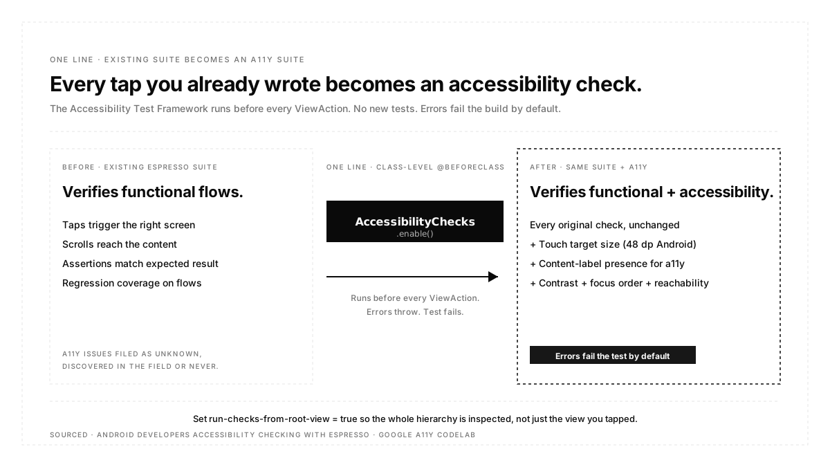
- One line converts an existing Espresso suite into an accessibility suite. Enabling the Accessibility Test Framework makes checks run before every view action you already wrote, and errors fail the test by default.
- The genuinely human part is smaller and more valuable than it looks. Whether a person can figure out what to do is the question no assertion answers, and it deserves the time you free up by automating everything above.
There is a persistent confusion in how teams organize mobile UI work, and it costs them coverage.
"UI testing" gets treated as verifying that buttons render and taps do things. "Usability testing" gets treated as an expensive research activity involving recruited participants, scheduled for later, and usually never scheduled at all. Between those two sits a large body of work that is neither: it has published numeric criteria, it can be checked automatically, and almost nobody checks it.
A button too small to hit reliably is not a rendering bug and not a research finding. It is a measurable defect with a specific threshold attached. So is an icon button with no label, which is invisible to a screen reader user. So is a focus order that jumps around the screen. All three fail against published numbers, and all three can fail a build.
This post is about drawing that line accurately: what belongs to the machine, what belongs to a person, and how to stop treating the middle as if it belonged to nobody.
What is mobile UI testing?
Mobile UI testing verifies that an application's interface renders correctly and responds correctly to input across the screen sizes, orientations, densities, and system settings its users have. It sits above unit testing, which never touches the interface, and overlaps with end-to-end testing, which drives the interface to verify a journey rather than the interface itself.
The distinction from functional testing is one of subject rather than method. Functional testing asks whether the feature works. UI testing asks whether the interface through which the feature is reached is correct, usable, and intact under conditions other than the developer's default.
Three terms that get used interchangeably
| Type | Asks | Method | Automatable |
|---|---|---|---|
| Functional Testing | Does the feature produce the right result? | Scripted assertions | Yes |
| UI Testing | Does the interface render and respond correctly? | Scripted assertions plus checks against thresholds | Mostly |
| Usability Testing | Can a person accomplish what they came to do? | Observation of real users | No |
The line between measurable and judgeable
Sort UI concerns by whether a published criterion exists.
Measurable, with numbers attached. Touch target dimensions. Presence of a content label on interactive elements. Contrast between text and background. Whether the layout survives increased font scale. Whether every element is reachable and in a sensible focus order. Whether the app functions in both orientations. Each of these has a threshold, and a threshold means a machine can decide.
Judgeable only. Whether the label wording makes sense. Whether the flow matches how someone thinks about the task. Whether an empty state tells the user what to do next. Whether the app feels trustworthy at the point where it asks for a card number. No assertion catches any of these, because the failure is comprehension rather than a violated rule.
Teams routinely treat the first group as if it belonged to the second, which is how it ends up in nobody's plan. It is cheaper to check than functional behaviour, because the criteria are fixed and platform-published.
The numbers for touch targets
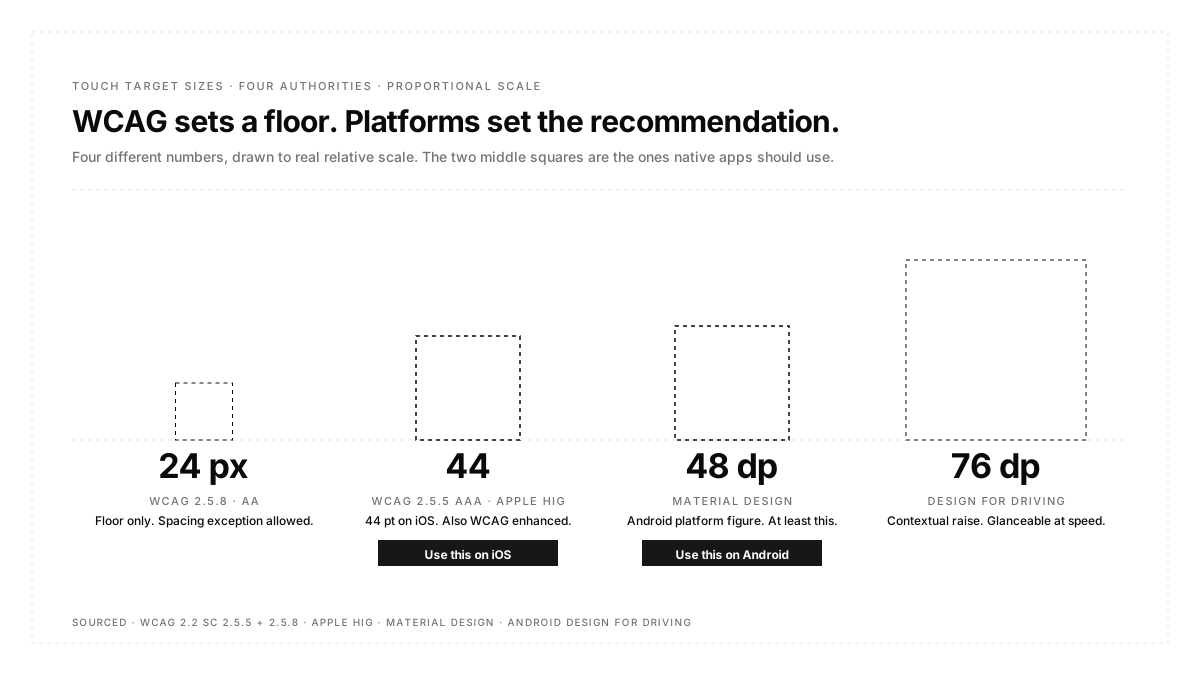
Touch target size is the clearest example, and it has an unusual property: three different authorities publish three different numbers, all of them correct within their own scope.
| Source | Minimum | Level |
|---|---|---|
| WCAG 2.5.8 Target Size (Minimum) | 24 by 24 px | AA, new in WCAG 2.2 |
| WCAG 2.5.5 Target Size (Enhanced) | 44 by 44 px | AAA |
| Apple Human Interface Guidelines | 44 by 44 pt | Platform guidance |
| Material Design | 48 by 48 dp | Platform guidance |
The WCAG figure of 24 is a floor rather than a recommendation, and it comes with a spacing exception: a smaller target can still conform if there is sufficient separation from adjacent targets, evaluated by centering an imaginary 24-pixel-diameter circle on each undersized target. The platform guidance numbers are larger and align with the AAA criterion rather than the AA one.
For native mobile, the practical rule is the platform number, so 44 points on iOS and 48 dp on Android. Android's own accessibility guidance phrases the distinction usefully: targets should be at least 48 dp and must be at least 24 dp. Context can raise the bar further, and Google's Design for Driving guidance recommends 76 dp by 76 dp, so a target is glanceable and selectable while a car is moving.
Two related criteria arrived with WCAG 2.2 alongside target size, both at AA: Dragging Movements, requiring a single-pointer alternative to drag operations, and the target size criterion itself. Older material describing WCAG 2.1 will not mention either.
Turning an existing espresso suite into an accessibility suite
This is the highest return available in mobile UI testing, and it takes one line.
The Accessibility Test Framework integrates with Espresso and calls AccessibilityChecks. enable() in a setup method causes checks to run automatically before any view action defined in ViewActions. You write no new tests. Every tap your existing suite already performs becomes an accessibility check on that view and its descendants.
Results are typed as ERROR, WARNING, or INFO, and by default an ERROR throws an exception and fails the test. The output is specific enough to act on directly. A real failure from Google's own codelab reads that a view is missing speakable text needed for a screen reader and that a view falls below the minimum recommended size for touch targets, giving the minimum as 48 by 48 dp against an actual size of 24 by 24 dp at a screen density of 2.6.
Three configuration options matter in practice.
Check the whole screen rather than one view. By default the check covers the view being acted on plus its descendants, so anything you never tap is never checked. Setting run-checks-from-root-view to true examines the entire hierarchy instead, which finds problems in elements your test never touches.
Choose which severity fails the build. The throw-exception-for setting controls whether ERROR alone fails the test or whether warnings do too. Starting at ERROR and tightening later is the sane progression.
Suppress specific known issues, not categories. Turning this on for the first time against a mature app produces a wall of failures, most of which you cannot fix this sprint. A suppressing result matcher stops those from failing the build. Google's guidance is explicit that you should suppress only specific known items rather than broad categories, because suppressing broadly hides the new problems you actually want to catch.
One practical trap: with more than one test method in a class, enable the checks in a class-level setup rather than a per-test setup, or the second test throws because accessibility checking is already enabled. The cleanest arrangement is a custom test runner that enables checks once for the whole suite.
The free accessibility audit you are already generating
Alongside the automated suite, Play runs an accessibility pass on real hardware every time you upload a build to a test track, as part of the pre-launch report.
Its accessibility findings are grouped into three categories. Content labelling covers elements labelled incorrectly for screen readers. Touch target size covers elements below the recommended dimensions. Implementation covers layout issues that make the app difficult to use for people with motor impairments. Findings are separated into errors, warnings, and minor issues, with screen clusters showing where each was found.
It costs nothing, it runs on devices you do not own, and it requires no setup. It is also the accessibility baseline most teams already have and have never opened.
What automated checks will not catch
Being precise about the ceiling matters, because a green accessibility check is not an accessible app.
A content label can exist and be useless. "Button" satisfies the presence check and tells a screen reader user nothing. A focus order can be technically valid and still move around the screen in an order that makes no sense. Contrast can pass on the design system's default background and fail against a photograph behind it. A gesture can have a documented alternative that is buried three screens deep.
More broadly, every automated check verifies a rule was followed rather than that the outcome is good. That gap is exactly where usability testing lives, and it is why the two are complements rather than a choice.
Running usability testing on mobile
Since the automatable work has been removed from the pile, what remains is smaller and worth doing properly.
Give participants tasks rather than screens. "Buy something using a saved card" surfaces more than "look at the checkout page," because the first has a goal the person can fail to reach and the second invites commentary.
Watch where hands go. Mobile usability has a physical dimension that a web does not: reachability with one thumb, whether the primary action sits under the keyboard, and whether a control lands where a case or a grip interferes. These are invisible in a screen recording and obvious when watching the device.
Test on the participant's own device where possible. Their font scale, their display size setting, their accessibility settings, and their notification volume are all part of the environment your app actually runs in, and a clean test device hides all of it.
Include at least one participant who uses assistive technology. Nothing exposes a useless content label faster than someone navigating with a screen reader for real.
Device and configuration coverage
UI defects cluster around configurations rather than devices, which makes the matrix smaller than it looks.
The variations that break layouts most often are increased font scale, the smallest and largest screen sizes you support, landscape orientation if you allow it, and dark mode. A layout tested only at default settings on one screen size has not been tested against most of its real failure modes.
Emulators cover this well, since these are rendering concerns rather than hardware ones, and they let you sweep configurations cheaply. Real hardware still matters where the manufacturer software layer changes rendering or where gestures interact with system navigation, which is what real device testing covers.
For the journey-level half, describing what a user does rather than which element to tap keeps tests alive across redesigns. Autosana's flows work that way by design, and the instruction-writing guidance explains why journey-level phrasing survives interface churn that identifier-bound assertions do not. Failures and UX observations from a run surface as issues with the point in the run they came from.
Best practices
Turn on accessibility checks before writing any new UI tests. It is the cheapest coverage available and it uses tests you already have.
Set touch targets from the platform number, not the WCAG floor. 44 points and 48dp, not 24.
Sweep font scale as a configuration, not an afterthought. Increased text size is the most common cause of clipped and overlapping layouts, and it affects a large number of users permanently rather than occasionally.
Assert outcomes, not element identifiers. A test bound to a control's name breaks on a rename and reports it as a defect.
Read the pre-launch report's accessibility tab on every release. It is generated whether or not you look.
Reserve human sessions for comprehension. If a machine can decide it, do not spend a participant's hour on it.
Conclusion
The reason mobile accessibility and usability get skipped is not that teams do not care. It is that the work sits in a category nobody owns, filed as research and therefore deferred. Splitting it by whether a published criterion exists fixes that. Touch targets, labels, focus order, contrast, and font scaling have numbers, belong in the automated suite, and mostly ride along on tests you already wrote. What is left over is genuinely about whether a person can understand your app, which is worth a human hour precisely because nothing else can answer it.
FAQ
What is the difference between UI testing and usability testing?
UI testing verifies the interface renders and responds correctly and can be automated. Usability testing asks whether a person can accomplish their goal and requires observing real users. A large middle band, including touch targets and screen reader labels, has published thresholds and belongs with the automated half.
How do I add accessibility testing to an existing Android suite?
Enable the Accessibility Test Framework in a class-level setup method. Checks then run before every view action your existing tests already perform, and errors fail the test by default. Set run-checks-from-root-view to true to examine the whole screen rather than just the view being acted on.
What is the minimum touch target size?
44 by 44 points on iOS and 48 by 48dp on Android, per the platform guidelines. WCAG 2.5.8 sets a lower AA floor of 24 by 24 pixels with a spacing exception, and WCAG 2.5.5 sets 44 by 44 at AAA. For native apps, use the platform number.
Can accessibility testing be fully automated?
No. Automated checks verify that a rule was followed, not that the result is useful. A content label reading "button" passes the presence check and helps nobody. Automation covers the measurable layer; a screen reader user covers the rest.
How many device configurations should UI tests cover?
Fewer devices and more configurations than most teams expect. Increased font scale, smallest and largest supported screen sizes, landscape if supported, and dark mode catch the majority of layout defects, and emulators handle them cheaply.
What breaks mobile layouts most often?
Increased font scale, followed by long strings from localisation, followed by the smallest supported screen. All three are cheap to test and rarely tested.
Do I need real users for usability testing?
For comprehension questions, yes, and a small number is enough to surface the major problems. For anything with a published threshold, no, because a machine decides it faster and more consistently.
Does the Play pre-launch report cover accessibility?
Yes. It reports content labelling, touch target size, and implementation issues found while crawling your app on real devices, graded as errors, warnings, and minor issues, and it is generated free on upload to a test track.